I am just "recovering" from Art Monaco.
This year I was a part of this huge event. Someone told me I was very brave to decide exhibiting there with the big sharks. I am happy I showed my art there and even happier it is over.
The show started with a black-tie event at 5pm on the 24th of April. I had finished installing my booth only 2 hours earlier. A few were still at this hard work during the opening.
At 5pm a swarm of people, all dressed at there best filled all the humongous venue. It was fascinating. It was scary.
Dressed with a white dress myself and high heels, I was sitting at my spot, looking at the crowd.
Looking at the crowd and watching the people manning their booths I came at some insights concerning the Art World -
The black-tie crowd
They come right on time and stay during the whole event. They fill the venue in their best clothes, their best perfumes. They come with their friends and families, throw themselves with hugs and kisses on others they meet there. They chat, they laugh, they are happy, they celebrate yet another pleasant evening. They give boost to the exhibition while members of the press are roaming around and take photos of celebrities. They are mostly filling the corridors, hardly entering the booths to take a close eye on the art.
The common visitors
Some come with their families, some come with one friend, some come alone. They come to see Art! They walk the corridors, they look at the art from the corridors. A very big piece that catches their eyes will usually not invite them in, they see it better from afar. It is the smaller pieces that attract them into a booth to examine the works carefully. They talk shyly to the people in the booth, sometimes take photos, always look at the price and then they go on to the next booth.
The investors and art dealers
You cannot tell who is an art investor in the crowd.
They follow the promotion days in advance and they look at the works online, and they are quick to follow their interest with a phone call or email. They are looking to put their hands on art that looks promising to them. Artists love them. They are giving a great support.
The people in the booths
These are the most fascinating ones from my point of view. I watched them carefully.
They are busy with the ART OF SEDUCTION. A smile, a flirt with the audience will invite them in. They hand everyone business cards and some more paper. They talk to the people immediately when an eye connection is made. They don't let them go until they finish to talk about the art they are representing. You can see immediately who is a professional in this trade, the professional ones will never sit, but stand in the entrance of the booth.
Myself
Not planning to be there so much, I did find myself spending many hours in my booth. Most of the time I was reading, avoiding any communications, bored to death.
I am just someone who enjoys doing art. Nothing special about me, the world is full of people like me. I definitely should not represent my art, I lack the ability to seduce.
I need to do what I am best at and avoid the rest.
Because the art of being an artist is merely to make art.
May 4, 2014
April 2, 2013
A new blog
I have started a new blog which is derived from my new environment.
Singapore is my second home now and it has much influence on my art.
So pay it a visit here.
See ya.
Singapore is my second home now and it has much influence on my art.
So pay it a visit here.
See ya.
November 30, 2012
The sum of all (p)arts
I have just finished my second forest with my new blue lines style.
Looking at it now I feel that it sums up many of my art works - mosaics, paper cuts and paintings.


I have started with the blue lines as usual on a pre-painted canvas (orange), continuing with the black that was carefully painted. Then everything looked too sharp so I painted all the background again, however, this time very roughly, covering the lines at times or even not covering the gaps perfectly, letting the orange pop up even in the grey area.
Below is a shot of the work in progress.

November 18, 2012
Blue Lines
A while ago I started a new style of painting. Got to admit, I am happy my long time art teachers cannot see it. Being trained on expression in art via composition, size and color, this new style don't meet (at all!) the education I acquired for more than 4 years. I can excuse myself by saying that this was more than half a century ago, but you should not buy it...
I wanted to give my boy a special painting and for no reason I can think about, I have done this painting.

I've started with the blue lines. I loved the movement of his hair. It gave it some energy, flow and a sense of composition. It took me a few weeks to finish. Since I started with the lines I had to work slowly and accurately between the lines. Stupid... I know... but I felt I needed the lines to guide me.
Since then I have made a few more paintings using the same method.


My last one is on canvas. I worked differently. I've started it with the background giving it somewhat an expressive mood.

More of these (and many more) can been seen on my Flickr.
July 13, 2012
JKPP
JKPP is for Julia Kay Portrait Party. Julia is an extraordinary artist who painted herself daily for a few years. You can read her blog here. She created a group on Flickr and this is where I come in... hmmmm... long time after the group was already created.
Members of the group post photos of themselves for other members to paint/draw.
I was the 700 and something member.
I discovered the group through Gila Rayberg, a long time Flickr friend. I followed the group as a spy. Daily. It took me at least a year of spying to have the courage to join in and then... I did.
It has been a while since I drew portraits, and drawing from photos was never any of my expertise. In the past, when I did portraits paintings or drawings it was always from life. Getting used to the 2D of a photo was a challenge. I still struggle with it. Every portrait that I make is a huge task. Some are more successful than others, some are bad, so bad that I have not posted them.
I do my best to choose different media. The most amazing thing for me is that I discovered the pastels... never touched them before during my 30 plus art years.
My first portrait was this:
.jpg)
The one that I love best is this:
.jpg)
I love it the best because it was my first ever use of pastels and because I love the light and shadows.
A lot was already written and said about Julia Kay, her project and group. So I just want to add -
Members of the group post photos of themselves for other members to paint/draw.
I was the 700 and something member.
I discovered the group through Gila Rayberg, a long time Flickr friend. I followed the group as a spy. Daily. It took me at least a year of spying to have the courage to join in and then... I did.
It has been a while since I drew portraits, and drawing from photos was never any of my expertise. In the past, when I did portraits paintings or drawings it was always from life. Getting used to the 2D of a photo was a challenge. I still struggle with it. Every portrait that I make is a huge task. Some are more successful than others, some are bad, so bad that I have not posted them.
I do my best to choose different media. The most amazing thing for me is that I discovered the pastels... never touched them before during my 30 plus art years.
My first portrait was this:
.jpg)
.jpg)
THANK YOU JULIA.
April 21, 2012
The process of doubts
I have just finished my new portrait papercute.
It was done from a photo of a young woman, very blond and with no marks on the face. It was a serious task to find the structure of the face and add the lines without "olding" her. I need the lines not only for making it more dramatic, but also so that I have "bridges" to keep piece from falling apart.
 I knew before hand that I'd paint the lips purple (as it was in the photo), and for about 2 hours I was happy...
Then I decided to have her lie on a yellow "bed".
I painted a white paper with various shades of yellows mixed with blues, greens and reds and then I tore the paper and assemble it to a new background (I am a mosaicist after all...)
I am not sure yet whether to have her on the yellow background or not. I'll let it rest for a few days and then I'll hopefully decide.
I promised in the previous post to post details of the process, so bellow you can see photos of the process. I always (try) to keep my promises... :-)


It was done from a photo of a young woman, very blond and with no marks on the face. It was a serious task to find the structure of the face and add the lines without "olding" her. I need the lines not only for making it more dramatic, but also so that I have "bridges" to keep piece from falling apart.

Then I decided to have her lie on a yellow "bed".
I painted a white paper with various shades of yellows mixed with blues, greens and reds and then I tore the paper and assemble it to a new background (I am a mosaicist after all...)
I am not sure yet whether to have her on the yellow background or not. I'll let it rest for a few days and then I'll hopefully decide.
I promised in the previous post to post details of the process, so bellow you can see photos of the process. I always (try) to keep my promises... :-)


April 20, 2012
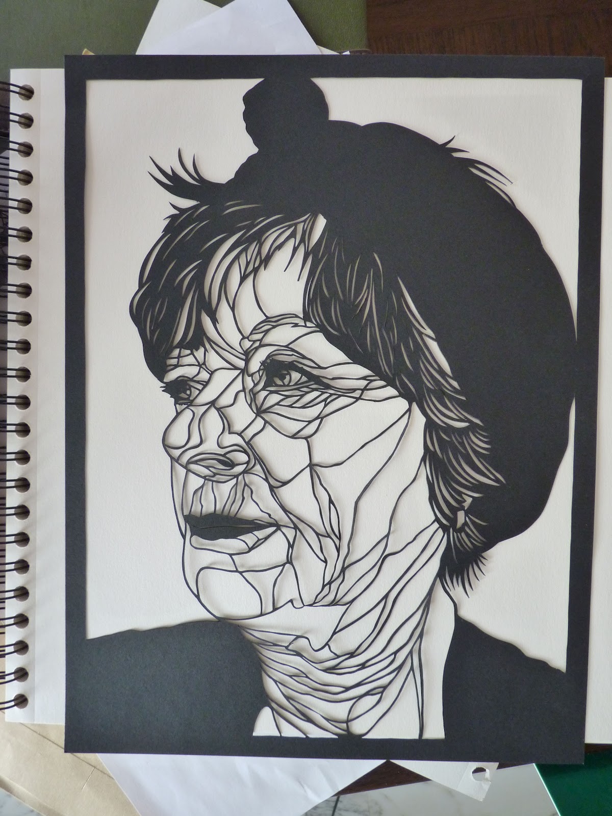
Paper cut process
I had a few question about my last papercut portrait, so here are some details. Unfortunately I didn't take photos of the process. I promise to do that with my next work and post it here.
 This one is smaller than my usual size of work.
I used Canson black paper, 24x32 cm, 160 g/m2 (about 9.5x12.5 inches. I don't know how to convert the weight of the paper, but it is double in weight than the ordinary printer paper.)
After finishing the cutting it "screamed" for some color. So I painted with acrylic some blue shades on her hair dress. But it was not enough. I felt I needed to add some warmth to it.
Next step then, I painted some white paper with shades of yellows, reds and blue but it looked too flat. I then changed the background color to fit the shape of the portrait in a way that the portrait itself has warmer and sharper shades of yellow.
Hope the photo bellow help you to see better the process.


Subscribe to:
Posts (Atom)